Hello everybody,
I’ve to say that we work a lot for the demo. Recently, I tried to rearrange the user interface of the game. The text box seems to be too big and at the end, with the characters and all the elements of the UI, we don’t see really the background which is a problem.
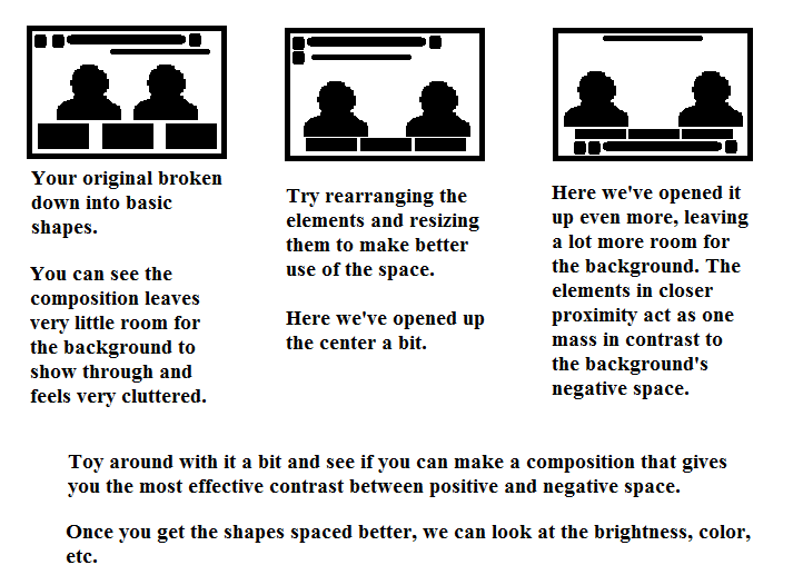
Thanks to Tigsourceforum, I had some interesting feedbacks. Here a picture to explain the importance of the organization of the UI.
So, here the first version of the bedroom scene and the next one. I redraw the characters and resized the elements of the UI with a new position for each one. What do you prefer ?
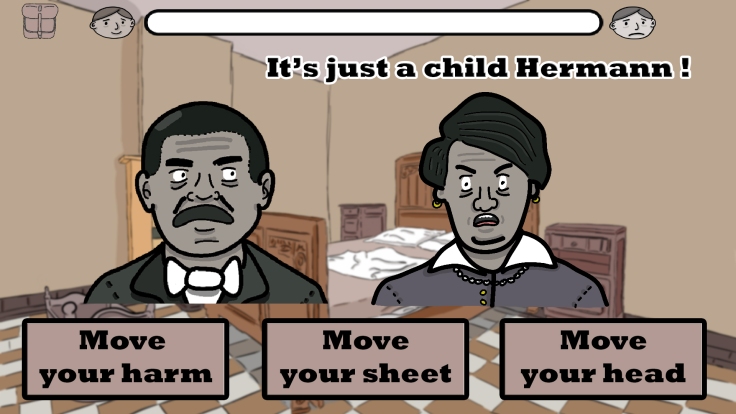
First version
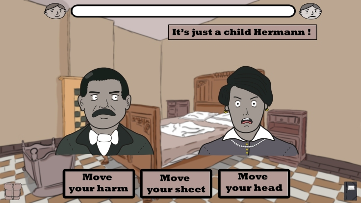
Second version
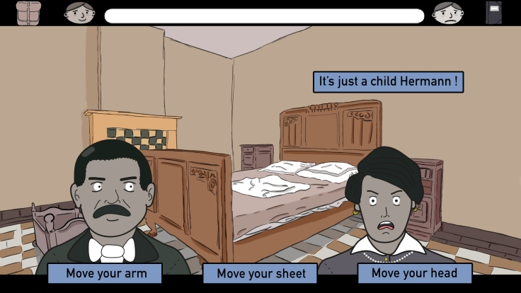
Thirs version
. Version française :
Bonjour à tous,
Penser à l’interface d’un jeu est une étape cruciale pour la réussite de ce dernier. Si l’interface (UI en anglais) est trop dense, on risque de fatiguer inutilement le regard du joueur. Il faut que l’ensemble soit cohérent et lisible.
Pour cette raison, et pour notre démo qui devrait sortir fin novembre, j’ai tenté de réorganiser la précédente interface grâce aux précieux conseils de développeurs indépendants sur Tigsource forum.
Ci-dessous, une image expliquant la réorganisation nécessaire de l’interface puis la première et deuxième version de la scène de la chambre. Dans la deuxième, on constate plus d’espace, et donc une meilleure lisibilité du background.


")


")


")


")


")


")


Commentaires récents